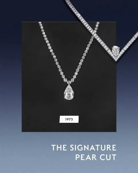
Chaumet Frames Its Pear Motif as the Joséphine Signature
Chaumet Frames Its Pear Motif as the Joséphine Signature
 Instagram
Chaumet Frames Its Pear Motif as the Joséphine Signature
In this specific execution, Chaumet centers the pear motif through the caption and the #ChaumetJosephine tag, framing it as an existing signature. The caption links the motif to the house’s “first and eternal muse” and uses “strength meets elegance” as the thematic frame. No performance data or collaboration partner is included, so the read is limited to how the brand stages this motif.
Why it matters
Chaumet uses this asset to make an archival design code legible to a social audience while keeping the product at the center. The pear motif is specific to Joséphine, and by naming it directly, the brand reinforces recognition for a collection that carries significant commercial and heritage weight. This matters because heritage jewelry houses increasingly compete through iconography — the ability to make a silhouette or cut instantly attributable without a logo or name on screen. In that context, the work is the tightening of association between one motif and one collection. The phrase “strength meets elegance” adds a contemporary register to a historical reference, but the work of differentiation comes from the pear motif itself. The post suggests that Chaumet sees explanatory captioning as a tool for maintaining the Joséphine line’s distinctiveness in feed environments where close-ups and stills dominate. Strategists should watch whether this emphasis on the pear motif recurs across Joséphine campaign series, new product introductions, or high jewelry content — and whether the motif begins to appear with stronger visual prominence, beyond verbal emphasis.
VQ Score
Likes
Comments